When Circuses Needed to Shout
In 1847, P.T. Barnum faced a crisis that would accidentally shape the visual landscape of American business for the next 175 years. His traveling circus needed posters—hundreds of them—printed quickly and cheaply in every town they visited. But the elegant typefaces that fine printing shops preferred were useless for circus promotion. They were too delicate, too refined, and worst of all, too quiet.
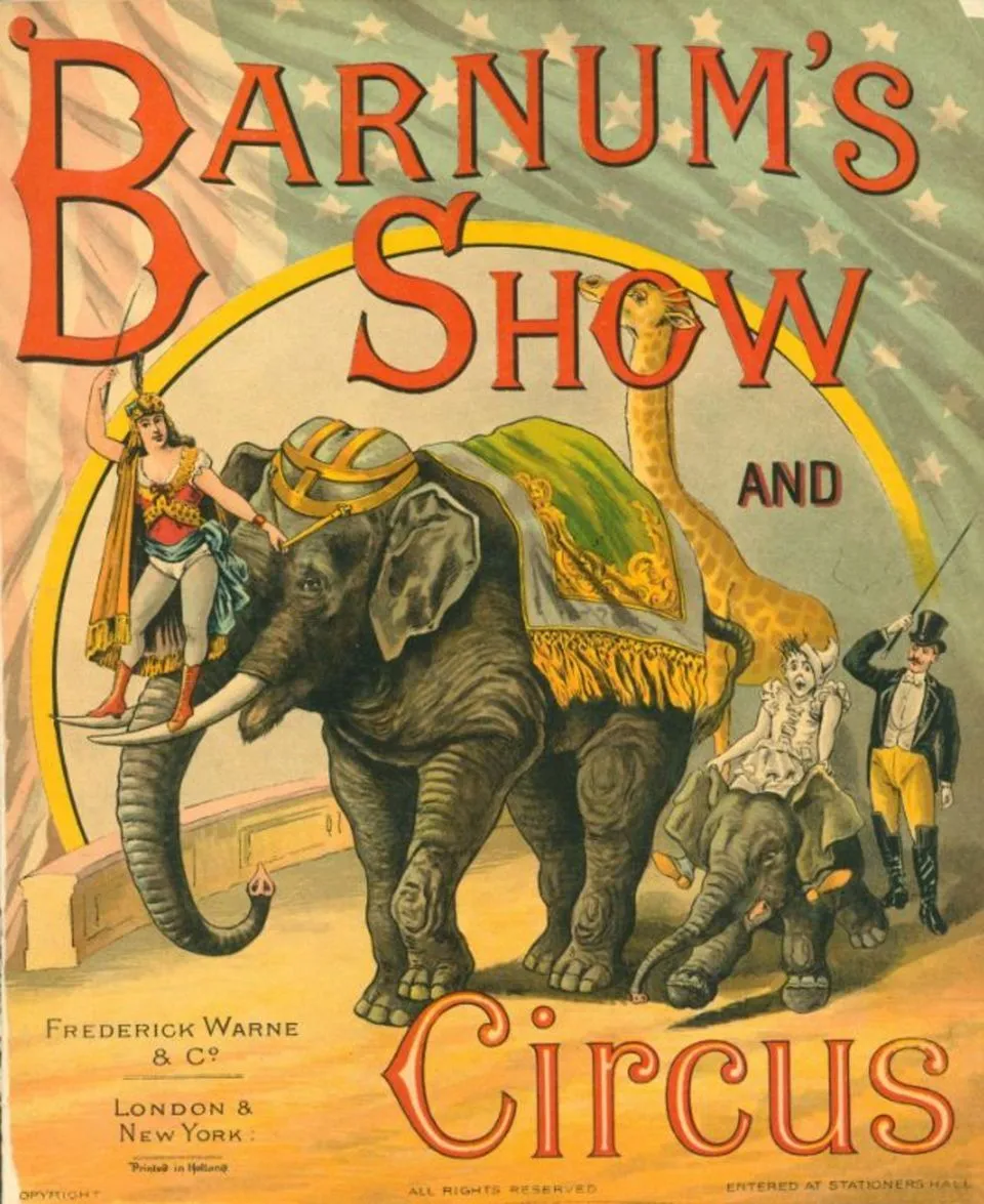 Photo: P.T. Barnum, via i.pinimg.com
Barnum needed letters that could scream from a fence post, grab attention from across a muddy street, and promise excitement to anyone who glanced their way. Traditional typography simply couldn't deliver the visual punch that circus life demanded.
The solution came from an unlikely source: wood type manufacturers who served the circus industry's desperate need for bold, attention-grabbing letters that could be carved quickly and printed cheaply.
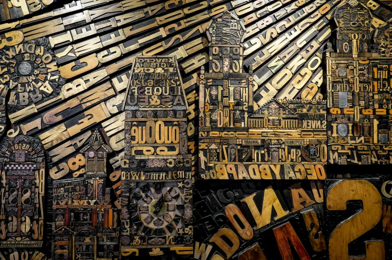
The Wood Type Revolution
Circus poster printing created an entirely new category of typography that respectable printers wouldn't touch. These letters were aggressively bold, dramatically condensed, and designed for maximum impact at minimum cost. Wood type carvers developed techniques for creating letters that were 75% taller than they were wide, allowing massive words to fit into narrow poster spaces.
The aesthetic was pure function over form: every curve eliminated, every serif simplified, every detail stripped away in service of visibility and speed. Traditional typographers dismissed these designs as crude and vulgar, but circus promoters loved them because they worked.
By the 1870s, specialized wood type foundries were producing hundreds of different circus-inspired fonts with names like "Antique Condensed," "Gothic Bold," and "Circus Gothic." These typefaces shared common characteristics: extreme boldness, tight letter spacing, and an unapologetic demand for attention.
From Big Top to Main Street
The transition from circus tents to American storefronts happened gradually, driven by practical considerations rather than aesthetic choices. Small business owners discovered that circus-style lettering solved the same problems for them that it had solved for traveling shows: how to grab attention quickly and cheaply.
Local sign painters began adapting circus typography for barbershops, general stores, and restaurants. The bold, condensed letters that had announced "DEATH-DEFYING TRAPEZE ACTS" proved equally effective at announcing "FRESH BREAD DAILY" or "SHOES REPAIRED."
By the 1890s, Main Street America was beginning to look like a permanent circus, with bold, condensed lettering dominating storefront signage across the country.
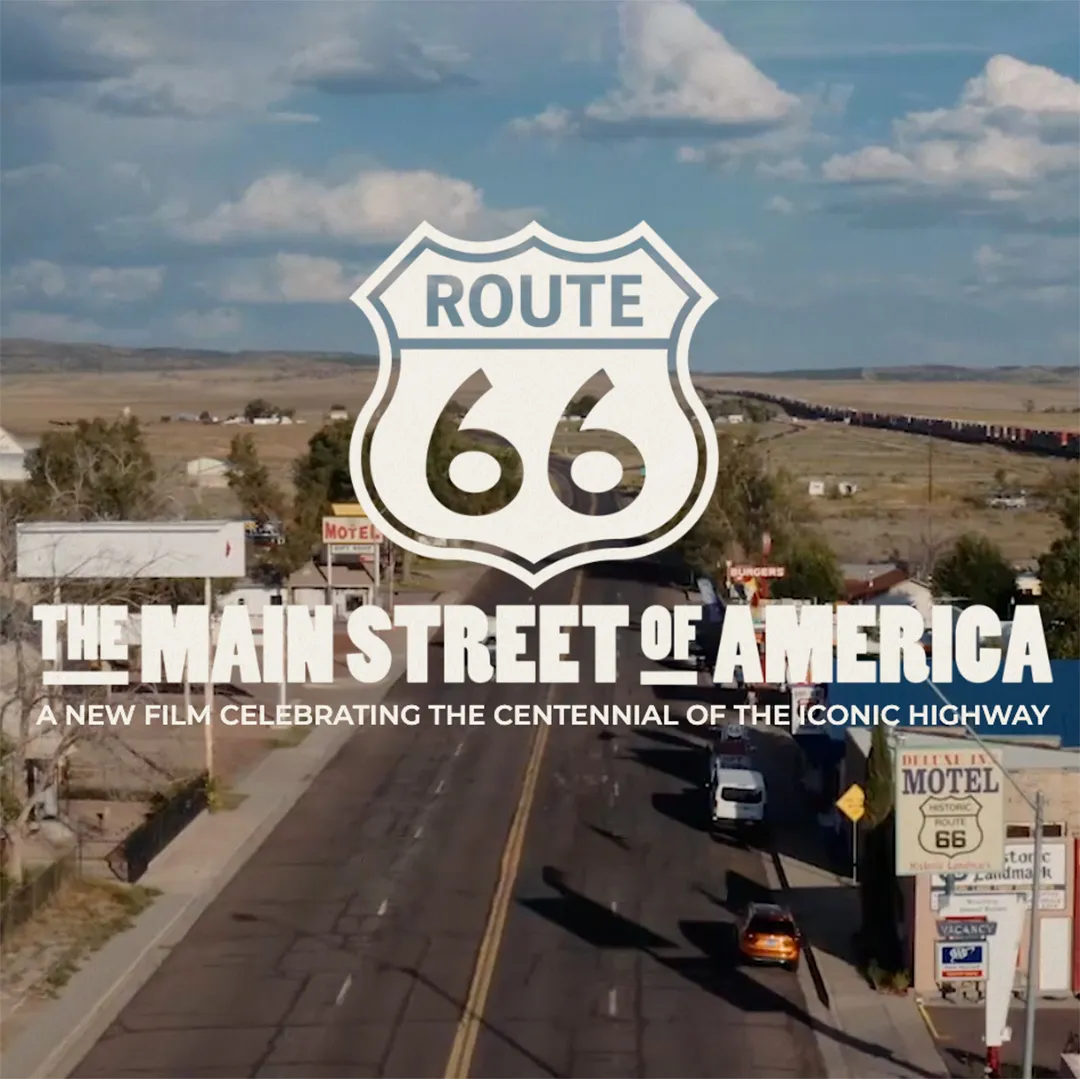 Photo: Main Street America, via route66centennial.org
The Newspaper Connection
The visual language of circus promotion gained additional legitimacy when newspapers began adopting similar typography for headlines. Publishers discovered that bold, condensed letters allowed them to fit more dramatic headlines into limited space, while grabbing readers' attention on crowded newsstands.
This newspaper adoption was crucial because it moved circus typography from the realm of entertainment into the world of serious information. When the same lettering style that announced circus acts also announced election results and war news, it gained cultural credibility that pure entertainment typography could never achieve.
The cross-pollination between circus posters and newspaper headlines created a distinctly American visual vocabulary that prioritized impact over elegance.
The Digital Resurrection
Circus typography might have remained a historical curiosity if not for the personal computer revolution of the 1980s and 90s. When desktop publishing software made sign-making accessible to anyone with a computer, developers needed fonts that would work well at small sizes on low-resolution screens.
Circus-inspired typography proved perfect for early digital applications. The bold, simple letter forms that had been designed for quick wood carving translated beautifully to pixel-based displays. Fonts like "Impact" and "Arial Black" brought circus aesthetics to millions of home computers.
Suddenly, every small business owner in America had access to the same attention-grabbing typography that had once required expensive custom sign painting.
The Template Economy
Today's digital design templates—used by millions of American small businesses for everything from Facebook ads to storefront banners—are direct descendants of 1800s circus typography. Popular design platforms default to bold, condensed fonts because they've proven most effective at grabbing attention in crowded visual environments.
The same principles that made circus posters effective in 1870—maximum impact, minimal cost, instant recognition—drive contemporary American commercial design. Strip mall signs, food truck graphics, and social media advertisements all rely on typography that traces its DNA back to P.T. Barnum's need to fill circus seats.
The Enduring Appeal
Circus typography succeeded in America because it matched the national character: bold, direct, and unafraid to make noise. While European design traditions emphasized subtlety and refinement, American commercial culture embraced the carnival aesthetic of maximum impact.
This preference persists today in everything from movie posters to political campaign signs. American design consistently chooses volume over sophistication, impact over elegance—values that were literally carved in wood by circus poster makers 150 years ago.
The Visual DNA of American Commerce
Next time you drive through any American commercial district, notice how many signs use bold, condensed lettering that would have been perfectly at home on a 19th-century circus poster. From "MATTRESS SALE" to "URGENT CARE," the visual language of American business still speaks in the vocabulary that traveling circuses created.
What began as a desperate solution to circus promotion challenges became the dominant aesthetic of American commercial life. The letters that once promised "AMAZING FEATS" now promise everything from "LOWEST PRICES" to "BEST SERVICE," but they're still shouting with the same voice that P.T. Barnum used to fill his big top.
American business discovered that when it comes to grabbing attention, nothing beats the visual equivalent of a carnival barker—and we've been using that approach ever since.